Sunday 22 April 2012

Gathering Inspiration

I was advised by my lecturer to try out some websites which would give me inspiration and ideas for my own packaging. One of the websites was http://www.thedieline.com.

I searched for Coffee and it gave me coffee package designs, belows are the ones which caught my attention.


This design doesn't seem like it would be on a packet of coffee but that's what I find most intriguing about it. The colours are vibrant and really burst off the packet, it intently grabs us as the audience's attention. The layout also allows the pieces to stand out, the fact that the only type on the front is the name of the brand and the coffee, most of the type is concentrated to the back of the packaging which means the main focus is kept on the bright design at the front. If I saw this in the shop I would buy it mainly on the packaging and how unique and beautiful it looks. 

The design is very simple, the colours aren't really bright or intense but more calm and mellow and keep to a certain type of tone. The type is very creative, ti looks like someone has signed it on in their own hand instead of being boring and stiff it flows with the image of the coffee cup. Even when comparing these designs to the  FC coffee House, they don't seem less important or exciting but they do have very different tones when trying to capture the feeling of coffee. With this like I said it is more mellow and relaxing whereas the FC has more energy and excitement towards coffee and wants to put that point across to the audience.


 The next two designs are very similar in how they use numbers to show the different versions of the same brand but different flavors or types of coffee beans. This design is however different to the other design below when it comes to the use of intense and metallic colours for the background. The colours really allow the product to be seen, the use of intense block colours makes this not look like coffee (similar to the FC coffee). I love the layout of this product, the use of the white circle to feature the important information as well as the number.


 This design is similar like I said to the one above where they use numbers on the front to show the different types of coffee they have to offer. However, this one lacks the use of colour for the background and concentrates more on the type and using it to their advantage. The large numbers grab the audience's attention when placed against the bright white background.

Monday 19 March 2012

Main Project:


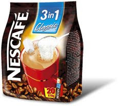
I decided to re-package a coffee product. Below are other examples of coffee brands and products that are around today.


With these products there is a similar pattern of packaging, simple and on the front shows coffee beans or a cup of coffee. Without even looking at the name we can easily tell what they are.

Monday 12 March 2012

Poster: Finished Design


The final design managed to come out better than I thought it would, its a very simple and basic design but I didn't want too much going on in the background. I chose to keep the maximum large background letters to 2 so it wasn't too complicated. I'm happy with how the design came out.

First Draft: Poster


Below is the first draft of my poster that I'm happy with, it still needs some work but right now its at an 'OK' stage.


Now this poster is meant to be A4 so parts of it should be cut off at the sides an tops and bottom so that some of the extra letters are cut off slightly. I like the Baskerville, I wanted them all to be going down at different angles so it gives this tumbling effect, the sub heading is 'Birmingham Typographer', its simple but effective.

BASKERVILLE Poster Development

Planning and Different Variations of Poster

1st


2nd


3rd


4th


As you can see it started off very empty with a lot of negative space and not a lot going on with the text in ways of angles or layout, it was many very basic. Then I continued to develop it by playing around with the layout of the letters, placing them on two levels. However, I still felt that I could go a lot further with the design, creating the word Baskerville and having it go diagonally down the page so it filled more. I then used inspiration from other typeface posters I had researched and placed odd letters for the background in various sizes. There is still more to develop upon but for my poster I don't want to have it too complicated, the whole point is the type and not the background, the background does need something to fill it but not so that it pulls the focus away from the type. Having a white background allows the type to become more striking and capture the audience's attention.

Typeface Inspiration Posters

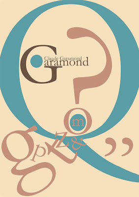
I decided to get some inspiration from other typeface posters which have been created for a similar purpose as the one I would make. Below are different typefaces represented.


The 4th poster would have to be my favorite, the use of different sizes for the letters as well as angles and layout allows it to stand out, it instantly shows to the audience the main point which is the type 'Garamond'. The colours compliment each other and I find it interesting to use large letters of the type as a part of the background.

Friday 24 February 2012

Task 04 - Research (Baskerville)


For Task 04 we have to create a poster based on one of the given typefaces, I chose Baskerville. The first part of the task is to collect as much research as we can on the typographer as well as the typeface. Below is the research I've collect so far, I will continue to post my ideas and resrearch (URLs of research can be seen at the end).

Baskerville


A Transitional Serif Typeface – Between the Old Style and Modern Style Typeface.


Designed by John Baskerville (1706 – 1775) in 1757.

Baskerville lived in Birmingham, England.

Baskerville was designed as an improvement on William Caslon’s typeface (Old style typeface).

John Baskerville’s advances in technology (formulating darker and faster-drying inks, inventing wove paper)

The typeface was sold by his widow, the typeface was passed around and went invisible until 1920 when it was rediscovered by Bruce Rogers.

Identifying Characteristics

tail on lowercase g does not close

swash-like tail of Q

small counter of italic e compared to italic a

J well below baseline

high crossbar and pointed apex of A

top and bottom serifs on C

W and w have no middle stroke

long lower arm of E

Many version feature a calligraphic J

T has wide arms

Resource Websites:-

http://www.rightreading.com/typehead/baskerville.htm

http://typophile.com/node/12622

http://en.wikipedia.org/wiki/Baskerville