With the traditional/Classical font I immediately thought of how elegant the style of script typefaces was, however I didn’t wish to use a typeface found on Word so I went online and used a font database (dafont.com). The font I chose ‘Jellyka Delicious Cakes’ doesn’t sound very traditional or classic in any way but without the name of the font, to me it does come across as a traditional/classical font. The curls and swirls of certain letters such as the ‘C’ and the ‘D’s as well as the start of the ‘T’, it reminds me of 18th century writing styles, very elegant and thought out.
 For the Modern, Clear and Functional typeface my first thought was Arial which is commonly used today as a default font but I didn’t want to use the most obvious font which everyone knew. Using Word I wanted to pick a font which nobody tended to use just because they could use Arial instead, the font I chose was ‘MV Boli’. With this font it was clear and easy to read, when I think of modern I think of Sans Serif fonts, they seem more strict and modern. MV Boli is a nice typeface but its one of many modern typefaces which can be found on Word.
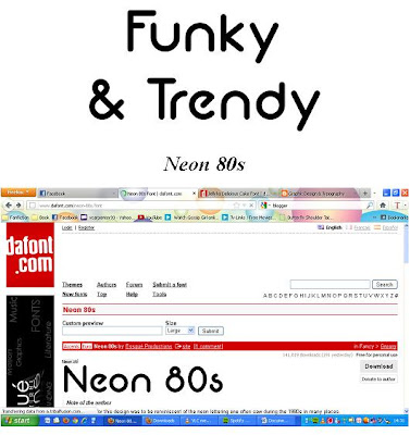
When I thought of Funky and Trendy I first thought of a groovy font that would relate to the 70s but then the word Trendy conflicted with this, I wanted the font to be trendy for the youth of our society. The font I chose was ‘Neon 80s’, it still had this Funky side it to but I could see it being used by teenagers and becoming a trend. I love the flow of the letters, especially the ‘U’ and the ‘N’ when I spelled out ‘Funky’. Its eye catching and seems very youthful, another font I probably would of chose would have been ‘Comic Sans MS’ but this didn’t seem Funky enough.

No comments:
Post a Comment