Friday, 24 February 2012

Task 03 - Composition

From the first part of the task (letter images) we could use these photos and create a composition of something we wanted to say or a simple phase or sentence (using the photos as the letters) or we could come up with our own design (without using the photos). I decided not to use the photos, it wasn't that I didn't like what I'd taken with my partner, it was just that I didn't want to use the same image for the same letter within the composition.

I thought of a saying which I could make with the product itself which was; 'Coffee or Tea?' Its an everyday question asked, this way I could use coffee for one part and Tea bags for the other. This didn't take me long, it was tricky at first but I decided to create a single letter each time so I could make it A3 size and then use Photoshop after to neaten it up. Below is the finished design.


I could have gone further with this design, adding little details like coffee stains or maybe even a mug but I wanted to keep it basic and straight to the point, the main focus was the words and not the background.

Task 03

This task was for us to work in pairs and go around the Worcester area and find objects or pieces of the landscape which represented or looked similar to letters in the alphabet. Below are the letters I found. I didn't find this task that difficult, it was fun looking at part of the city and trying to see any letter hidden within the buildings or the landscape.


A


B


C


D


F


I


K


M


N


O

P


Q


S


T


V


W


X


Z


Monday, 13 February 2012

Task 01

Task 01: Find Three fonts which show a) Traditional/Classical Typeface b) Modern, Clear and Functional Typeface c) Funky and Trendy Typeface


With the traditional/Classical font I immediately thought of how elegant the style of script typefaces was, however I didn’t wish to use a typeface found on Word so I went online and used a font database (dafont.com). The font I chose ‘Jellyka Delicious Cakes’ doesn’t sound very traditional or classic in any way but without the name of the font, to me it does come across as a traditional/classical font. The curls and swirls of certain letters such as the ‘C’ and the ‘D’s as well as the start of the ‘T’, it reminds me of 18th century writing styles, very elegant and thought out.


For the Modern, Clear and Functional typeface my first thought was Arial which is commonly used today as a default font but I didn’t want to use the most obvious font which everyone knew. Using Word I wanted to pick a font which nobody tended to use just because they could use Arial instead, the font I chose was ‘MV Boli’. With this font it was clear and easy to read, when I think of modern I think of Sans Serif fonts, they seem more strict and modern. MV Boli is a nice typeface but its one of many modern typefaces which can be found on Word.

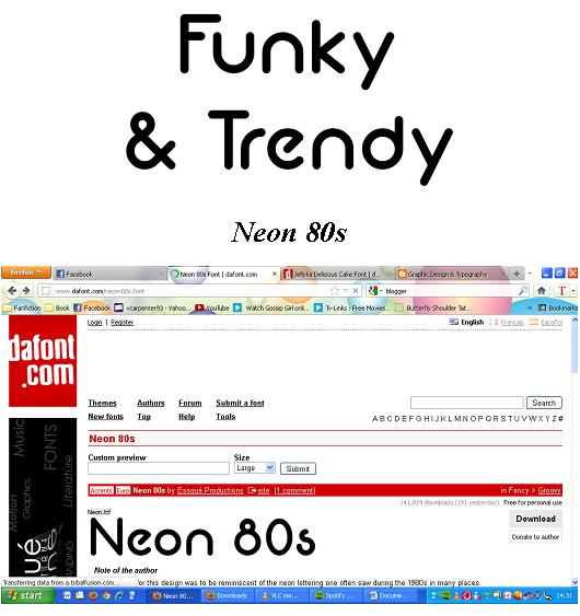
When I thought of Funky and Trendy I first thought of a groovy font that would relate to the 70s but then the word Trendy conflicted with this, I wanted the font to be trendy for the youth of our society. The font I chose was ‘Neon 80s’, it still had this Funky side it to but I could see it being used by teenagers and becoming a trend. I love the flow of the letters, especially the ‘U’ and the ‘N’ when I spelled out ‘Funky’. Its eye catching and seems very youthful, another font I probably would of chose would have been ‘Comic Sans MS’ but this didn’t seem Funky enough.

Introduction

This blog is to be my Learning Journal/Sketch Book of Graphic Design & Typography. I decided to keep a blog instead of a paper journal, I wanted to see if a blog would be a better choice than a paper journal. I will scan all work done in/for class as well as do all assignments and update on anything I've learnt as well as notes.