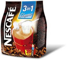
I searched for Coffee and it gave me coffee package designs, belows are the ones which caught my attention.
Sunday, 22 April 2012
Gathering Inspiration
I searched for Coffee and it gave me coffee package designs, belows are the ones which caught my attention.
Monday, 19 March 2012
Main Project:
Monday, 12 March 2012
Poster: Finished Design
First Draft: Poster

BASKERVILLE Poster Development
Typeface Inspiration Posters
Friday, 24 February 2012
Task 04 - Research (Baskerville)
Baskerville
A Transitional Serif Typeface – Between the Old Style and Modern Style Typeface.
Designed by John Baskerville (1706 – 1775) in 1757.
Baskerville lived in Birmingham, England.
Baskerville was designed as an improvement on William Caslon’s typeface (Old style typeface).
John Baskerville’s advances in technology (formulating darker and faster-drying inks, inventing wove paper)
The typeface was sold by his widow, the typeface was passed around and went invisible until 1920 when it was rediscovered by Bruce Rogers.
Identifying Characteristics
tail on lowercase g does not close
swash-like tail of Q
small counter of italic e compared to italic a
J well below baseline
high crossbar and pointed apex of A
top and bottom serifs on C
W and w have no middle stroke
long lower arm of E
Many version feature a calligraphic J
T has wide arms
Resource Websites:-
http://www.rightreading.com/typehead/baskerville.htm
http://typophile.com/node/12622
http://en.wikipedia.org/wiki/Baskerville

Task 03 - Composition
I thought of a saying which I could make with the product itself which was; 'Coffee or Tea?' Its an everyday question asked, this way I could use coffee for one part and Tea bags for the other. This didn't take me long, it was tricky at first but I decided to create a single letter each time so I could make it A3 size and then use Photoshop after to neaten it up. Below is the finished design.

I could have gone further with this design, adding little details like coffee stains or maybe even a mug but I wanted to keep it basic and straight to the point, the main focus was the words and not the background.
Task 03


Monday, 13 February 2012
Task 01

With the traditional/Classical font I immediately thought of how elegant the style of script typefaces was, however I didn’t wish to use a typeface found on Word so I went online and used a font database (dafont.com). The font I chose ‘Jellyka Delicious Cakes’ doesn’t sound very traditional or classic in any way but without the name of the font, to me it does come across as a traditional/classical font. The curls and swirls of certain letters such as the ‘C’ and the ‘D’s as well as the start of the ‘T’, it reminds me of 18th century writing styles, very elegant and thought out.
 For the Modern, Clear and Functional typeface my first thought was Arial which is commonly used today as a default font but I didn’t want to use the most obvious font which everyone knew. Using Word I wanted to pick a font which nobody tended to use just because they could use Arial instead, the font I chose was ‘MV Boli’. With this font it was clear and easy to read, when I think of modern I think of Sans Serif fonts, they seem more strict and modern. MV Boli is a nice typeface but its one of many modern typefaces which can be found on Word.
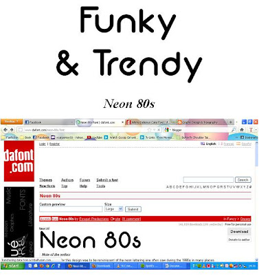
When I thought of Funky and Trendy I first thought of a groovy font that would relate to the 70s but then the word Trendy conflicted with this, I wanted the font to be trendy for the youth of our society. The font I chose was ‘Neon 80s’, it still had this Funky side it to but I could see it being used by teenagers and becoming a trend. I love the flow of the letters, especially the ‘U’ and the ‘N’ when I spelled out ‘Funky’. Its eye catching and seems very youthful, another font I probably would of chose would have been ‘Comic Sans MS’ but this didn’t seem Funky enough.


